
The Power of Color Psychology In Marketing: How to Harness The Science and Emotional Impact Of Color
Nov 20, 2023In the pulsating universe of marketing, where every pixel matters, color isn't just about looking good; it's a strategic powerhouse. Here, the vibrant hues of your brand aren't mere adornments; they are silent influencers of consumer choices, capable of transforming browsing into buying. Ever wondered why the iconic golden arches of McDonald®'s make you crave a burger? That's color psychology at play.
Now, let's distinguish between branding and marketing. Your branding sets the tone, crafting a distinct identity, while marketing is the grand stage where that identity shines. We're about to unravel the secrets of color that can elevate your marketing game, especially in the realm of conversions.
Remember, there is no color that will only work in one way every time. Color is much smarter than that.
The double-slit experiment proved that light - aka color - reacted as a particle when someone was in the room, and a wave when someone was not.
That means that color can and will evolve every day, every month, every year - as it has throughout history.
Your marketing will evolve as well to reflect those cultural, behavioral and psychological changes that will occur.
For example, right now in fall of 2023, culture is fatigued with pink due to the epic release of the Barbie® movie and its psychological ties to red, pink and white.
Therefore, companies should be steering clear of pink and utilizing more calming tones that elicit a response that is not as physical. Feel free to enjoy this article I was quoted in on why blue is the color of choice for 2024 among huge color companies like Sherwin Williams and Benjamin Moore!
Every hue has the potential to subconsciously sway consumer behavior, steering individuals towards or away from a product or brand.
Whether you're creating a new blog, sending out email campaigns, updating social posts or investing in new ad strategies, understanding the science of how colors evoke specific feelings in consumers can give you a competitive edge in terms of engagement, conversions and sales.
Imagine a world where your color choices don't just catch eyes but guide hands to click 'buy.' It's not fiction; it's the art of understanding how colors trigger specific responses in your audience. Think of blue creating trust or red driving urgency—it's beyond aesthetics; it's a language that speaks to your customers.
So, get ready to turn your color palette into a revenue generator! From tweaking your brand marketing palette to fine-tuning color choices in your campaigns, we'll explore the tactics to make your brand not just seen, but remembered, shared, and, most importantly, acted upon.
In this blog, we'll explore the intricate relationship between color psychology and consumer behavior, unveiling the strategic methods through which businesses can harness the power of color to captivate and compel their audience effectively.
This isn't a journey into the color wheel; it's a venture into the minds of your consumers. The colors you choose aren't just a backdrop; they are the script that influences the narrative of your brand. Ready to harness the full spectrum of color psychology for marketing success? Your vibrant journey begins now!
Color Associations
Colors take center stage in your marketing narrative, each possessing a unique ability to stir emotions and conjure shared associations. It's like having a secret language that directly taps into people's feelings.
Imagine red stepping up with its sense of urgency and passion, urging customers to seize your deals before they slip away. Then there's the serene and dependable blue, your trusted ally in establishing reliability. And of course, yellow, the lively burst of joy and enthusiasm that instantly lifts the mood.
Embark on this journey through the spectrum as we spill the secrets on how to strategically utilize these colors in your marketing strategy. Where you can actually start predicting conversions knowing that you've done the homework, you've found the visual connection to your messaging and you're ready to fully connect with your customer. So, brace yourself – we're diving into a realm where colors aren't just hues but potent tools in your marketing arsenal!
Red: The Color of Attention & Passion

In a red marketing campaign, I know immediately that direct action will be higher.
For example, when consulting on an email campaign that needed a lot of "take action" energy, we used red throughout the text of the emails.
Not only did the open rate increase, but the click-through rate went through the roof from 5% to 22.5%! Unheard of, right?
That doesn't mean red is the right choice for every campaign. The message needs to be fully aligned.
For example, I would never use red in a campaign with veterans. The psychological impact of red could be very triggering.
It takes time to make sure colors are being used correctly. Let's break down red to see if it may be a good color for you to incorporate!
Associations:
- Passion
- Energy
- Love
- Urgency
- Danger
- Alertness
- Excitement
Psychological Impact:
Red, the vibrant powerhouse of colors, doesn't just catch your eye; it commands your attention. This dynamic hue isn't merely a visual stimulant; it's a catalyst for action.
Its association with passion and love has made it a go-to choice for industries immersed in romance, food, and entertainment. A study at the University Of Rochester concluded that people who had red hair, red clothing, or even red lipstick were seen as 30% more attractive.
Remember, red causes us to stop and pay attention. Our blood pressure and pulse quicken, our eyes dilate, and we start to sweat.
However, in the realm of marketing, red becomes a strategic weapon, invoking a sense of urgency that propels swift decision-making and prompts impulsive actions.
Red isn't just a color; it's the embodiment of attention, a visual cue that signals, "Act now!"
Cultural Impact:
Red holds diverse cultural meanings across the globe. In Western cultures, it's synonymous with intense emotions, vitality, passion, and excitement, making it a top choice for marketing strategies aiming to evoke powerful responses. The Republican party in the United States strategically employs red to amplify its presence in politics.
In sports, red uniforms have been linked to more victories due to referees' bias. In Eastern cultures, particularly in China and India, red symbolizes good luck, prosperity, and happiness. Traditional Chinese and Indian weddings feature red prominently, representing a prosperous union and divine spark, respectively. However, in African cultures like Nigeria and South Africa, red takes on somber connotations, symbolizing death, grief, violence, and sacrifice.
The cultural diversity in red's symbolism underlines the importance of considering regional nuances in marketing strategies.
Marketing Applications:
- Sale promotions
- Limited-time offers
- Call-to-action buttons
- Food and beverage ads
- News broadcasts + social shares
- Sports team uniforms, promotions + social feeds
When using the color red in marketing - serious thought has to be paid to find the right shade.
- If you use a black-based red, it is going to feel much more serious and grounded.
- If you use a white-based red, it will feel lighter, less serious, and more energetic. Think Sonic.
- If you use a gray-based red, it will feel more calming + detached.
- If you use the true hue, it will feel very alarming + emergent. Think CNN.
Red, the dynamic powerhouse among colors, has been a driving force in numerous successful marketing campaigns, leaving an indelible mark on consumer perceptions. Across various platforms, the strategic use of red has consistently demonstrated its ability to captivate and spur action.
In digital marketing, the implementation of red call-to-action buttons has proven to be highly effective. Brands frequently leverage red's association with urgency and attention to prompt swift decision-making. For instance, e-commerce platforms often use red buttons for "Buy Now" or "Shop Today," harnessing the color's psychological impact to create a sense of immediacy and drive conversions.
For example, Coca-Cola's "Share a Coke" Campaign. Coca-Cola's iconic red branding has been a cornerstone of its marketing strategy for decades. The "Share a Coke" campaign took this a step further by personalizing the packaging with individual names in red. This not only reinforced the brand's association with joy and celebration but also created a sense of personal connection, encouraging consumers to share the experience.
Also, Netflix's "Watch Instantly" Red Button. When Netflix shifted its focus to streaming services, the introduction of the red "Watch Instantly" button was a deliberate choice. The color red, associated with urgency and action, was strategically employed to prompt users to engage with the content immediately. This small but impactful use of red contributed to the success of Netflix's streaming platform.
In the realm of sales promotions, red takes center stage. Limited-time offers, discounts, and flash sales benefit from the commanding presence of red. The color not only attracts attention but also instills a sense of urgency, motivating consumers to seize the opportunity before it's gone. This is exemplified in campaigns where red is prominently featured in promotional banners and headlines, emphasizing the time-sensitive nature of the offer.
Sports marketing is another arena where red reigns supreme. Teams, logos, and sports-related campaigns often incorporate red to evoke passion, energy, and excitement. From sports uniforms to promotional materials, red plays a crucial role in creating a visual identity that resonates with fans and fosters a sense of connection. Some examples are Manchester United, Chicago Bulls, Liverpool FC, Boston Red Sox and Ferrari.
The food and beverage industry frequently wields red to stimulate appetite and convey a sense of indulgence. Fast-food chains, candy brands, and beverage companies utilize red in logos, packaging, and advertising to evoke the emotions of desire and enjoyment. This strategic use of red aligns with its psychological impact on arousal and heightened sensory experiences. Some examples are McDonalds, KFC, Wendy's, Burger King and Pizza Hut. Almost every commercial is focused on red to get a potential buyer's attention.
Red in marketing is more than just a color—it's a catalyst for action and a visual cue that demands attention. Whether employed in digital interfaces, sales promotions, sports branding, or the food industry, red proves to be a versatile and impactful tool in shaping consumer behavior and driving engagement. Red is a strong psychological primary color that gets the body to react the most. Obviously, if you want to impact someone's thinking, spark their optimism, or even help them connect, red isn't going to be the right color choice. But if you want them to take action, see something very clearly, or even get more in tune with their body, this could be the perfect color.
Orange: The Color of Energy & Playfulness

If I decide to use orange in a marketing campaign, I know it's going to be a wild ride. Orange is a fascinating color in that it has such varied meanings.
Advertise in India, and the resulting feelings will be spiritual, like purple in most other countries.
Use it with children, and they'll feel energized and playful. Use it with adults, and they'll feel more balanced and familial.
For example, I recently consulted with a company that is bringing more healing and mindfulness to the corporate space.
They had already chosen orange as their primary brand color, but they wanted to make sure it was in alignment for their upcoming presentations, with the goal of securing the company as a client.
Orange was absolutely the right choice, but not the yellow-based orange they had. It would be perceived as too childish, maybe even cheap. We added more red to the color and created a gradient in the logo - as well as throughout the presentation. We brought in more orange imagery that had the vital red undertone.
The results were stunning. The red brought so much empowerment to the orange and a more serious urgency that was much needed.
Orange has a lot of potential as a marketing color. But its meaning needs to be fully understood.
Orange can exude a sense of playfulness and enthusiasm, making it a popular choice for brands targeting a youthful and dynamic audience. But it can also make someone feel more balanced and at home with themselves, making it a good choice for a wellness app or even an interior decorator.
For example, I would never use orange as the forward color in marketing home apparel. It may be perceived as too cheap.
But for a discount shoe store like Payless? Absolutely!
Orange loves its trickery - remember how popular it was in circuses! So let's break it down.
Associations:
- Energy
- Family
- Balance
- Home
- Social
- Enthusiasm
- Creativity
Psychological Impact:
Orange, the vibrant lovechild of energetic red and optimistic yellow, isn't just a color; it's an exuberant statement. With a playful and enthusiastic aura, it effortlessly captures the essence of youth and dynamism, making it a favored choice for brands catering to a lively audience.
Unlike the high-octane red, orange says "hello" in a stable, approachable manner. It's a color that grabs attention without the frenetic urgency, a warm and welcoming hue that balances fun and excitement with a touch of reliability and a sense of home.
In marketing, orange becomes a versatile tool, weaving together the threads of energy, balance, and a dash of adventure.
Orange is often associated with joy, playfulness, and enthusiasm. It can evoke feelings of warmth and friendliness, creating a positive and inviting atmosphere. In a study conducted by the University of Manchester, orange was found to be one of the colors most associated with positive emotions.
The color orange is linked to feelings of optimism and creativity. It stimulates mental activity and encourages innovative thinking. Brands or marketing campaigns aiming to convey a sense of innovation and positivity often incorporate orange to enhance these associations.
The vibrancy of orange makes it a popular choice for brands targeting a youthful and dynamic audience. It suggests energy, movement, and a modern outlook. This is evident in the success of tech companies and adventure brands that use orange to convey a sense of excitement and forward thinking.
Orange is considered a color that bridges the gap between the physical and the emotional. It can be both stimulating and comforting, creating a balanced emotional response. This makes it suitable for brands that want to appear approachable, reliable, and emotionally connected to their audience.
Studies have indicated that the color orange can stimulate the appetite. This is particularly relevant in the food and beverage industry, where orange is strategically used to make products, logos, or packaging more enticing. Fast-food chains often leverage this aspect of orange to promote their products effectively.
Cultural Impact:
When incorporating orange into your marketing strategy, it's crucial to recognize its diverse cultural meanings, reflecting its dynamic and energetic nature.
In Western cultures, orange is synonymous with enthusiasm and playfulness, making it ideal for creating excitement, especially in contexts like fairs, theaters, and Halloween. Understanding the association of orange with family in Native American cultures emphasizes its potential for conveying warmth and cheerfulness. Meanwhile, in Eastern cultures, particularly in Hinduism, saffron-hued orange signifies courage and renunciation.
The spiritual and transformative symbolism associated with orange in Buddhism and China suggests that its use in marketing can evoke a sense of positive change and heightened awareness. Consider the cultural nuances carefully to harness orange's diverse meanings and effectively communicate your marketing message.
Marketing Applications:
- Sports and fitness ads
- Children's products
- Entertainment events
- Technology and innovation
When using the color orange in marketing - there is less wiggle room in specific color choice.
- The warmer the orange, the more inviting and nurturing it will feel, like Nickelodeon®.
- The cooler the orange, the more fun and detached it will feel, like Fanta®.
- The brighter the orange, the more energetic and youthful it will feel.
- The deeper the orange, the more serious it will feel.
Orange, a vibrant and attention-grabbing color, has carved its niche in the realm of successful marketing campaigns, leaving an enduring imprint on consumer engagement. Across diverse marketing platforms, the strategic use of orange has consistently demonstrated its ability to convey energy, positivity, and modernity.
In digital marketing, the incorporation of orange in branding elements and promotional materials has proven to be highly effective. Brands targeting a youthful audience often leverage orange's association with vibrancy and enthusiasm to create a compelling online presence. For instance, tech companies use orange in call-to-action buttons, inviting users to explore innovative features or try new products. This strategic use of orange not only captures attention but also aligns with the youthful and dynamic image that many tech brands aim to convey.
One notable example is Amazon's incorporation of orange in its branding. Amazon, known for its vast online marketplace, uses orange strategically to convey friendliness and approachability. The orange smile in the logo not only symbolizes customer satisfaction but also adds a touch of enthusiasm, making the brand more relatable and engaging. This subtle yet impactful use of orange contributes to Amazon's success in creating a trustworthy and customer-centric image.
In the realm of sales promotions, orange takes center stage, particularly in limited-time offers and promotional banners. The color's warm and inviting nature makes it an ideal choice for creating a sense of urgency without the starkness of red. This is exemplified in campaigns where orange is prominently featured in "Flash Sale" announcements or "Exclusive Offer" promotions, encouraging consumers to act swiftly and seize the presented opportunity.
Consider the "Orange Scream" campaign by Fanta, which utilized vibrant orange visuals on social media platforms like Instagram and Snapchat. The campaign featured fun and playful content, leveraging the psychological impact of orange to create excitement among the audience. Fanta effectively turned its product into a symbol of joy and refreshment, aligning with the optimistic and dynamic associations of the color orange.
Sports marketing is another arena where orange adds a burst of energy and excitement. Teams, logos, and sports-related campaigns often incorporate orange to evoke a sense of playfulness and enthusiasm. For instance, the Dutch national football team prominently features orange in their uniforms, creating a distinctive and recognizable visual identity that resonates with fans. Some notable examples are the Clemson Tigers, Houston Astros, Denver Broncos, New York Knicks, and Miami Dolphins.
The food and beverage industry strategically wields orange to stimulate appetite and convey a sense of warmth and home. Fast-food chains, snack brands, and beverage companies utilize orange in logos, packaging, and advertising to evoke the emotions of friendliness and reliability. This strategic use of orange aligns with its psychological impact on creating a positive and inviting atmosphere, making products more enticing for consumers. Some examples are Orange Crush, Tang, Cheez-Its, and Sunkist.
In digital advertising, the travel industry has often employed orange to convey a sense of adventure and excitement. Travel websites and apps use orange in call-to-action buttons, banners, and promotional materials to encourage users to explore and take action. The color's psychological impact of fostering enthusiasm and warmth contributes to creating an inviting and compelling online presence. Think of EasyJet or Expedia.
Orange, in the realm of marketing, transcends being just a color; it's a visual cue that radiates positivity, excitement, and approachability. Whether applied in digital interfaces, sales promotions, sports branding, or the food industry, orange proves to be a versatile and impactful tool in shaping consumer perceptions and fostering engagement. Understanding the nuanced associations and psychological impact of orange allows marketers to wield this color strategically, creating a vibrant and resonant brand presence in the marketplace.
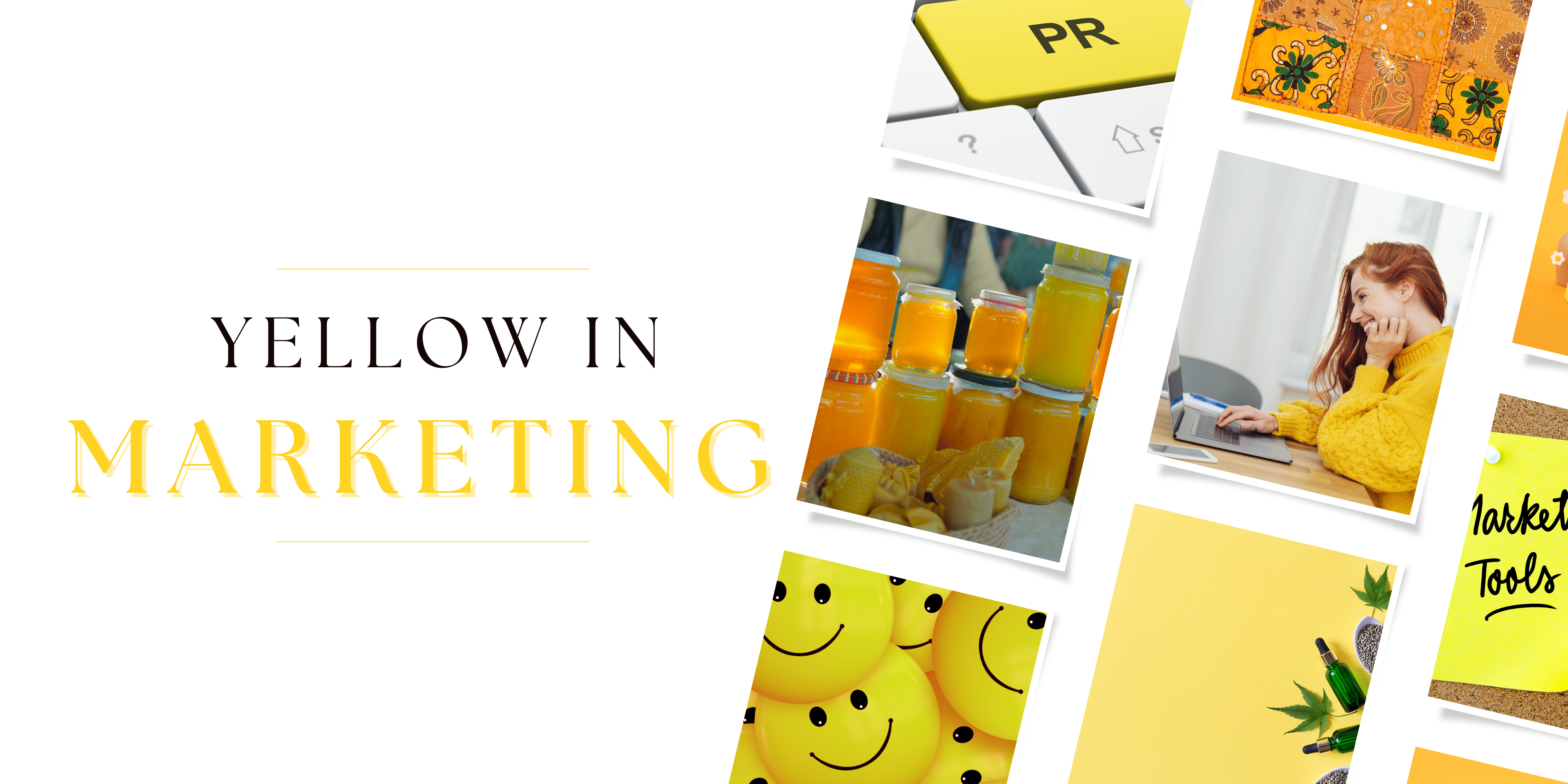
Yellow: The Color of Optimism & Energy
I think, overall, yellow is one of the most magical colors. Over the years, the clients who have chosen to rebrand and then market with forward-facing yellow color palettes have by far seen the most dramatic results.
That's not to say that it's the go-to color - for some industries, it could be the worst choice!
But it certainly isn't a color to be underestimated, especially when it comes to marketing.
This vibrant hue is not a one-size-fits-all solution, as its impact can vary across industries. However, underestimating the potential of yellow in marketing would be a mistake.
From a color psychology perspective, yellow is a beacon of positivity, energy, and warmth. It has the innate ability to capture attention and radiate optimism, creating a lively and uplifting atmosphere. Linked to feelings of happiness, yellow serves as a powerful tool in marketing to convey enthusiasm and establish a cheerful and welcoming vibe.
Beyond its emotional impact, yellow is known to stimulate mental processes and enhance creativity. The vibrancy and attention-grabbing nature of yellow make it an invaluable asset for creating memorable and impactful marketing campaigns.
Associations:
- Optimism
- Joy
- Caution
- Invigoration
- Happiness
- Warmth
- Clarity
Psychological Impact:
Yellow, the vibrant and energetic hue, extends its influence beyond mere visual appeal to evoke a profound psychological impact. This color, associated with positivity and happiness, goes beyond catching the eye – it invigorates the senses.
The wavelength of yellow light stimulates the lymphatic flow in the body, creating a physiological response that heightens excitement to its peak. Its warm and friendly associations make yellow a powerful tool in marketing, where it is strategically used to craft a cheerful and approachable brand image.
Industries related to hospitality, travel, and lifestyle leverage the psychological impact of yellow to foster a sense of warmth, friendliness, and optimism. Yellow not only captures attention but also creates an emotional connection, making it a valuable asset for brands seeking to communicate joy and approachability to their audience.
The bright and energetic nature of yellow can activate the mind, enhance concentration, and stimulate the production of serotonin, a neurotransmitter associated with feelings of happiness and well-being. In educational settings, yellow is sometimes used to create an environment that fosters learning, as it is believed to promote mental alertness and positivity.
Cultural Impact:
In Western cultures, yellow emerges as a radiant symbol of warmth, happiness, and optimism. Its vibrant and energetic presence frequently graces magazine publications, infusing a positive and lively atmosphere. Despite its global association with caution, particularly in traffic signs and lights, yellow remains a heavenly hue, radiating positivity and joy.
Across Eastern cultures, the meaning of yellow unfolds in rich layers. In China, it stands as the most esteemed color, embodying happiness, glory, and wisdom. Once exclusive to emperors, bright yellow now symbolizes royal power. Distinguished guests are greeted with a yellow carpet, underscoring the color's revered status. Brands venturing into the use of yellow in their marketing strategies should be attuned to these cultural nuances.
When weaving yellow into your marketing fabric, bear in mind its multifaceted nature. It signifies both caution and honor, its connotations shifting with cultural contexts.
Marketing Applications:
- Travel and tourism
- Children's products
- Food and beverage packaging
- Event promotions
- Hospitality
When using the color yellow in marketing - there's a lot of choices to be made.
- Will you choose a darker yellow that feels more grounded and safe?
- Or a lighter yellow, that feels happier and more optimistic?
- A cool yellow will feel more focused, like Ikea.
- Whereas a warm yellow will feel friendlier, like Denny's®.
Yellow emerges as a dynamic force in marketing, finding versatile applications across diverse industries.
In the hospitality and travel sector, yellow creates a welcoming and cheerful image, as seen in the branding of hotels like Holiday Inn Express®.
The food and beverage industry strategically employs yellow to stimulate appetite, with brands like McDonald®'s and Subway® incorporating the color in their logos and branding.
In fashion and lifestyle, yellow signifies optimism and modernity, making it a popular choice for brands like IKEA® and Best Buy®.
Children's products often feature yellow to tap into their playful and energetic qualities, as exemplified by Fisher-Price® and LEGO®. In the technology sector, yellow adds warmth and positivity to branding materials, creating a more approachable image for companies like Snapchat.
Wellness and lifestyle apps like Headspace® use yellow to foster a positive user experience, while event promotion benefits from yellow's association with joy and celebration, as seen in the branding of music festivals like Coachella®.
Even in retail, yellow is effective for drawing attention to sales and promotions, creating a sense of urgency in brands like Zara® and H&M®. Thoughtfully applied, yellow proves to be a powerful tool in creating memorable and positive brand identities.
Green: The Color of Identity & Growth

Green, I find, is one of the most interesting colors to use in marketing as it is the only one that triggers someone's sense of self-identity.
A few years ago, I was able to work with a client who owned an investment firm. In his world, most competitors used blue.
Growing a stable and abundant financial future, however, screamed of green to me.
We implemented it into all forward-facing materials, and it was amazing to see the personal tie the company started exuded in all of its marketing efforts.
Green steadily breeds stability. That's the best way I can think to say it.
Growth, health, wealth - yes. But green is so much deeper than that. Green gives us a grounded strength, the ability to truly thrive.
Let's look deeper into the color green from a marketing perspective.
Associations:
- Nature
- Growth
- Health
- Wealth
- Identity
- Freshness
- Harmony
Psychological Impact:
Green, the color that mirrors the serenity of nature, stands as a symbol of stability and well-being in the palette of color psychology. Just as the lush greenery stabilizes and balances the natural world, green, when used strategically, creates a sense of grounding and calmness for consumers. It is a color, when used as a primary that stabilizes all the other colors. With associations of growth, health, and harmony, green becomes a vital tool in the marketer's arsenal, offering a visual language that resonates with individuals seeking a balanced and sustainable lifestyle.
Research in color psychology has delved into the impact of green on human behavior and perceptions. While specific studies may vary, a general consensus exists regarding the positive associations and effects of green. One notable study conducted by the University of Georgia found that exposure to green environments contributes to increased feelings of relaxation and stress reduction. This aligns with the broader understanding of green as a color that promotes calmness and well-being.
Cultural Associations:
In Western cultures, green flourishes as a symbol of nature, growth, and freshness. The vibrant green landscapes of Ireland celebrated during St. Patrick's Day, evoke images of green rivers, outfits, and even beer. The Shamrock, a nature-provided green grass, has become synonymous with luck. In Native American cultures, green is revered for its balancing qualities, believed to aid both physical and mental well-being, mirroring their use of green herbs for medicinal purposes.
Across Eastern cultures, green takes on associations with luck, prosperity, and vitality. In Japan, green holds a symbolic connection to nature and tranquility. The traditional matcha iro, the color of matcha green tea, is a restful hue often worn in clothing. The Japanese celebration of Greenery Day on April 29th, Emperor Shoowa's birthday, highlights their deep love and respect for nature. This day pays homage to the emperor's passion for natural science and vegetation.
When incorporating green into your marketing strategy, consider the varied cultural associations, from the lush landscapes of Ireland, celebrated on St. Patrick's Day in the West to the deep reverence for nature observed on Greenery Day in Japan. Understanding the diverse meanings attached to green can help tailor your message to resonate effectively across different audiences.
Marketing Applications:
- Eco-friendly products
- Health and wellness brands
- Organic and natural foods
- Outdoor and recreational products
When using the color green in marketing - you have the most choices of color to choose from!
- If you choose a deep, cool green, it will feel stable and detached, like Land Rover®.
- If you choose a light, warm green, it will feel adventurous and energetic, like Animal Planet®.
In marketing, the applications of green are as diverse as the ecosystems it represents. Brands seeking to convey environmental consciousness and a commitment to well-being often turn to green to enhance their visual identity. From eco-friendly products to health and wellness brands, organic and natural foods to outdoor and recreational products, green serves as a powerful conduit for these messages.
For example, Whole Foods Market® strategically incorporates green in its branding, aligning with its focus on natural and organic products.
Similarly, The North Face®, a renowned outdoor brand, utilizes green to evoke a sense of adventure and connection with nature.
Gain®, a laundry detergent, shows people leaning into this brand as their only choice in their green-forward commercials.
Starbucks® often employs green in its store decor and packaging, further reinforcing the association with natural elements and creating a harmonious and inviting atmosphere. The brand's use of green extends beyond aesthetics; it serves as a strategic choice to communicate values of quality, sustainability, and a connection to the origins of its products. Starbucks effectively demonstrates how the color green can be woven into various aspects of branding and marketing to evoke specific emotions and perceptions.
In marketing, various studies have explored the consumer response to green, especially in the context of eco-friendly and sustainable products. For instance, a study published in the Journal of Business Ethics revealed that consumers often associate green packaging with environmentally friendly practices, influencing their purchasing decisions. This suggests that the color green can serve as a powerful visual cue, signaling a commitment to sustainability and attracting consumers with eco-conscious preferences. Research continually evolves, and these studies contribute valuable insights into the psychological impact of green in both natural and commercial settings.
Green, in the marketing landscape, becomes a symbol not just of color but of growth, health, and a pledge to nurture a greener and harmonious world.
Remember, this color has the most available shades and options for selection, so consider this an encouragement to try "outside the lines" and find a green that hasn't been used before in your forward-facing marketing campaigns!

Blue: The Color of Trust & Serenity
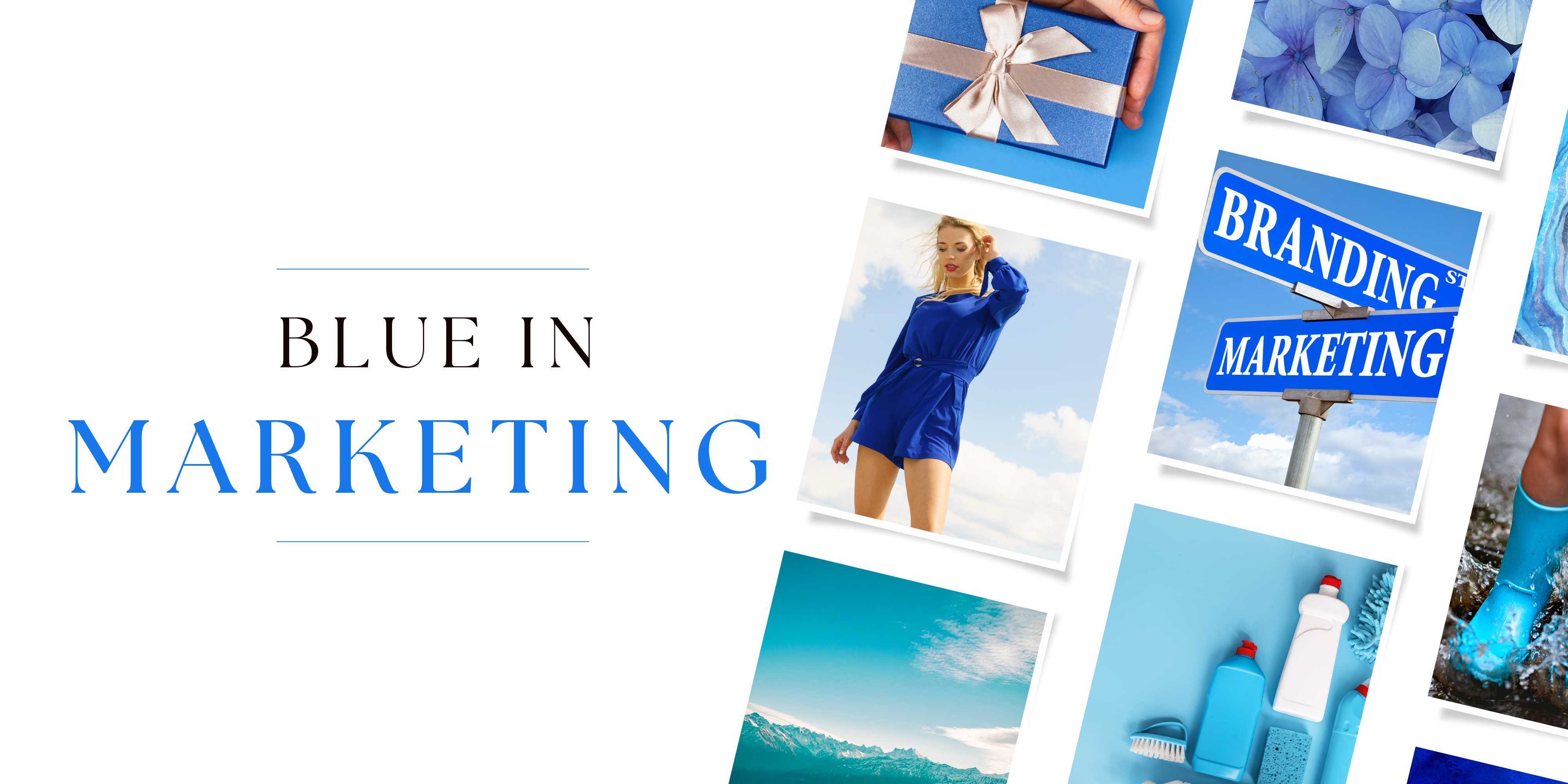
Blue is considered the workhorse of most marketing campaigns and is most widely used.
Perhaps leaned on too heavily due to its calming effect and ability to create trust and authority when it comes to a brand's perception; this is wholly due to blue's influence as a psychological primary color of the mind.
It literally impacts how we think.
Blue, often hailed as the cornerstone color of marketing, stands out as a versatile and widely embraced color, earning its reputation as a go-to choice in branding strategies.
This color's prevalence is not merely a coincidence but is rooted in its profound psychological impact on the human mind. Beyond its aesthetic appeal, blue wields the power to influence thoughts, creating a calm and trustworthy aura that many consumers find irresistible.
As we delve into the realm of color psychology, the dominance of blue becomes more than just a visual preference; it becomes an intentional strategy, shaping how consumers perceive and interact with a brand. Let's unravel the nuances of blue and explore its significance in the dynamic world of marketing.
Associations:
- Trust
- Authority
- Serenity
- Intelligence
- Secure
- Calmness
- Learning
- Professionalism
Psychological Impact:
Marketing Applications:
- Corporate branding
- Financial services
- Healthcare products
- Technology companies
When using the color blue in marketing - you're dealing with very opposing meanings when choosing the shade.
- A deep blue will stimulate deeper thought processes, like HP®.
- Whereas a light blue will feel like more of an escape, like Skype®.
Blue, a steadfast player in marketing strategies, proves its versatility by carrying a range of associations that make it an essential choice for industries aiming to influence consumer behavior. Renowned for its calming effect and the perception of reliability, blue has become a strategic color for brands seeking to establish trust and authority in the market.
Financial institutions strategically leverage blue in their marketing campaigns, utilizing its connotations of stability and dependability. Notable examples include American Express and Bank of America, where blue takes center stage in advertisements and promotional materials.
Tech giants like IBM and Facebook strategically deploy blue to convey reliability and competence, aligning their marketing efforts with qualities that resonate with their target audiences.
Healthcare and pharmaceutical companies, such as Pfizer, use blue in their marketing materials to evoke trust and confidence in their products.
The widespread and intentional use of blue in these diverse industries underscores its effectiveness in influencing consumer perceptions and enhancing the overall success of marketing strategies.
To reinforce the impact of blue in marketing, it's worth delving into the psychological studies that highlight its influence on consumer behavior.
Studies have shown that the calming effect of blue is not only subjective but has measurable physiological effects. For instance, research conducted by the University of British Columbia revealed that exposure to the color blue led to increased creativity and higher levels of trust.
In marketing, this translates into creating an environment where consumers feel at ease and are more receptive to messaging. Additionally, blue has been associated with enhancing cognitive performance and promoting a sense of security, attributes that resonate with audiences across various industries.
Incorporating insights from such studies provides a deeper understanding of why blue is a powerhouse in marketing, offering tangible benefits beyond mere aesthetics. However, it's important to note it's potential overuse. With it being held as the color of 2024, attention must be paid to whether or not this will make you more noticed or blend into the background.
Purple: The Color of Luxury & Connection

Purple, often regarded as the color of royalty and luxury, carries a sense of mystery and sophistication that captivates the imagination.
I find purple to be a boring choice in most predictable industries, specifically ones that focus on spirituality, magic, or royalty.
Purple can do so much more than that. I have found purple to do one thing more than anything else: bond. It helps build deep relationships. It also helps prompt transformation.
Combining the stability of blue and the energy of red, purple sits at the intersection of calm and stimulation. It has historically been associated with power, wealth, and creativity, making it a compelling choice for brands seeking to convey a sense of prestige and individuality.
However, studies have shown that consumers tie purple to the mystical ten times more than the royal. This is most likely due to its use in film, especially Disney movies regarding villains and magic.
In the realm of marketing, purple is a versatile tool, eliciting emotions of opulence and inner acceptance.
I once worked with a coach who had stuck with a neutral palette most of her career. Her biggest message? Transformation.
Encouraging her to pivot to purple, her brand photos, social media posts, and advertisements made the pivot. The result? Explosive growth!
Understanding the nuanced associations and psychological impact of purple unveils its potential to create a unique and resonant brand identity, appealing to audiences across diverse industries.
Whether used for premium products, artistic endeavors, or innovative services, purple has the ability to evoke a sense of regality, allure, and transformation that sets a brand apart in a visually saturated market.
Associations:
- Luxury
- Royalty
- Wisdom
- Creativity
- Mystery
- Spiritualism
- Mysticism
- Connection
Psychological Impact:
Historically linked to notions of royalty and luxury, purple extends its influence into realms of creativity and imagination. Its mystical undertones add an intriguing layer to its psychological allure, often associated with spirituality and introspection.
The color evokes a sense of mystery, prompting contemplation and sparking imaginative thoughts. This complex interplay of calming stability and energetic stimulation positions purple as a color that can inspire creativity, elevate mood, and add a touch of mystique to the human psyche.
It lies at the very end of the visible light spectrum, holding the shortest wavelength. It's the last color we see at sunset, making it feel more spiritual and light.
Cultural Impact:
When delving into the cultural nuances of purple in Western societies, it's clear that this color holds multifaceted meanings. Purple is emblematic of luxury, royalty, and sophistication. Notably, in the United States, it takes on a solemn role as the color of honor for military service members awarded The Purple Heart, an accolade reserved for those who have made significant sacrifices or given their lives in the line of duty. However, purple is also intertwined with spiritualism and associated with rites of mourning. In Guatemala, purple robes are worn during Holy Week, symbolizing the pain and suffering of Christ. Similarly, in Brazil, devout Catholics wear purple to grieve a loved one, considering the color sacred and reserved for funerals.
In Eastern cultures, particularly in Thailand, the significance of purple takes a distinct turn. Saturdays are designated for wearing purple, as it is the color associated with Shani, the Hindu god of justice, and linked to the planet Saturn. Her Royal Highness Princess Maha Chakri Sirindhorn's birth color, purple, is reflected in her royal standard and presence at events. Moreover, purple becomes a visual element in mourning customs, with widows donning the color while other mourners adhere to black attire.
Understanding these diverse cultural interpretations enables marketers to navigate the symbolic richness of purple, leveraging its associations in ways that resonate with varied audiences, from transformation to relational connection.
Marketing Applications:
- High-end fashion
- Entertainment
- Art and creative industries
- Food & High-End Snacks
- Spiritualism
When using the color purple in marketing - the biggest choice is warm or cool.
- A warm purple will feel more connective, like Curves®.
- Whereas a cool purple will feel more elegant, like Purdy's Chocolates®.
Purple, renowned for its association with royalty, luxury, and creativity, extends its impact into the psychological realm, invoking a sense of imagination and mystique.
In marketing, purple becomes a versatile tool for brands seeking to enhance the perceived value of their products and services.
Cadbury®, a prominent example in the chocolate industry, strategically uses purple in its branding to communicate a premium and opulent feel, elevating its chocolates beyond mere confectionery. They effectively utilize purple to elevate the perceived value of its chocolates, creating a sense of luxury and opulence in the minds of consumers.
In the tech realm, Yahoo!® incorporates purple in its marketing strategies, associating color with innovation and creativity, essential elements in the dynamic technology landscape.
Hallmark®, deeply rooted in connectivity through relationships, harnesses the power of purple to convey creativity and artistic expression in its marketing campaigns, deeply resonating with its audience. During the holiday season, you'll hear many people say, "I watch Hallmark".
Lululemon®, operating in the spiritual and wellness sector, leverages purple to evoke a sense of inner balance and well-being, tapping into the color's mystical associations.
Studies have consistently shown that purple is associated with creativity, luxury, and uniqueness. For example, a study published in the Journal of Environmental Psychology highlighted how purple is often linked to feelings of sophistication and opulence.
Moreover, the color's connection to creativity has been investigated in studies examining color preferences in design and aesthetics. Researchers have found that purple is frequently chosen by individuals with a preference for innovative and imaginative thinking.
Although not exhaustive, these studies contribute to the understanding of purple's psychological impact, shedding light on its associations with creativity, luxury, and uniqueness in various contexts.
As you can see, purple is an underutilized color that has potentially one of the strongest impacts on the energetics of the mind, body, and spirit. When used in a marketing campaign, it can have impactful and long-lasting results!
Pink: The Color of Softness & Sweetness

The color pink, often synonymous with femininity, love, and tenderness, has emerged as a powerful tool in the realm of marketing. Its versatile nature allows it to convey a wide range of emotions, from compassion to playfulness to even dessert-hunger, making it a favorite choice for various industries.
Recently, I was contacted by The Knots Churros, a dessert churro company in the United Kingdom, to chat about the power of pink - which was their primary brand color.
I told them so few studies had been done, so they decided to bring in Censuswide to poll over 2,000 British locals.
47% said that surrounding themselves in vibrant colors makes their food taste better. Pink tops the charts for Brits’ top-tasting colors, with 82% saying it evokes feelings of joy and 49% feeling more energized.
Here's what's really interesting. After doing a campaign push featuring lots and lots of pink, we were able to achieve a 5.4% increase in social followers for The Knot Churros, who now boasts a following of over 180,000. Red Lion PR coined "dopamine dining," and the public's response was immediate.
Pink is a color that has become so much more than just "sweet" or "feminine." It has transformed into a truly impactful color with flexible usage that gives positive feelings.
Associations:
- Friendship
- Comfort
- Sweetness
- Femininity
- Safety
- Compassion
- Playfulness/Fun
Psychological Impact:
Pink is often associated with romance and tenderness, and its softer shades convey a sense of sweetness and compassion.
It's a popular choice for brands targeting a predominantly female audience or those aiming to evoke feelings of warmth and nurturance.
The historical association of pink with femininity and blue with masculinity underwent a significant shift in the mid-20th century.
Before this transformation, pink was often considered a masculine color, while blue was associated with femininity.
Department stores in the 1940s even promoted pink as a suitable color for boys. However, these color associations gradually reversed, and by the 1980s, pink had firmly established itself as a predominantly feminine color.
One notable experiment involved painting jail cells pink to observe their effects on inmates. The hypothesis was that the calming nature of pink could reduce aggression and create a more peaceful atmosphere when used in admittance cells. Calming effects lasted for up to 30 minutes, whereas when multiple long-term cells were painted, aggression increased.
I believe this is due to pink's undertone of red, which is why pink has become more publicly fatigued after Barbie's release.
Cultural Impact:
Navigating the cultural landscape of pink reveals its diverse meanings in Western and Eastern cultures. In Western societies, pink is synonymous with romance, sweetness, and femininity. Beyond its aesthetic appeal, pink serves as a powerful symbol in campaigns for breast cancer awareness, conveying support and hope. The color also finds its way into idioms like "pink slip" for job termination, "pink-collar worker" denoting jobs traditionally associated with women, and expressions like "tickled pink" and "in the pink" reflecting emotional and health-related states.
Across the Atlantic, in England, pink takes on legal significance, tied with a pink ribbon during legal proceedings as a symbol associated with the defense. In France, redcurrant, a shade of pink, is adopted in academic dress for Medicine and Health graduates, while Spain and Italy term romance novels as "pink novels."
Turning to Eastern cultures, pink assumes various connotations, including beauty, transience, and compassion. In India, pink turbans grace Hindu weddings, and the color rose is linked to the heart chakra in Hindu and Buddhist beliefs. Notably, the association of pink with spiritual leaders, as seen in Meher Baha's choice of pink to please a devoted follower, adds depth to its cultural significance.
Acknowledging these diverse interpretations empowers marketers to harness pink's versatile and culturally relevant meanings, from softness, to calmness to even war, for inclusive and resonant campaigns.
Marketing Applications:
- Beauty and skincare products
- Fashion and accessories
- Gifts and special occasions
- Products for children
- Food
- Retail
- Entertainment
- Health
- Technology
When using the color pink in marketing - you have to really dig into the emotional impact of the color on an audience.
- If you choose a warm, bright pink, it will feel very youthful and fun, like Baskin Robbins®.
- Whereas a deep, soft-muted pink will feel more sophisticated and feminine, like Victoria's Secret®.
Obviously, Barbie took over the marketing world for a solid three months, pushing pink worldwide. Read my breakdown of color psychology and the color pink relating to the Barbie movie here.
With over 100 brand sponsorships and billions in revenue generated from ad campaigns, this was the most notable income generator reduced to one major color component: pink.
The industries where pink was used most were food, retail, entertainment, cosmetics, health, and technology.
Vistaprint® found that in the last 12 months, the proportion of pink logos increased by a whopping 46% — an indication that small business owners and designers are more open to using pink in branding.
In marketing, pink is frequently used to evoke a sense of warmth and connection with the audience. Brands that choose pink as a primary color often aim to convey approachability and a friendly demeanor. From beauty products to clothing lines, pink is employed to signify notions of care, self-expression, and youthful exuberance.
One notable example of effective pink marketing is the cosmetics brand Glossier®. Glossier utilizes soft shades of pink in its branding, packaging, and marketing materials. This choice aligns with the brand's emphasis on natural beauty, simplicity, and inclusivity. The use of pink contributes to a visually appealing and welcoming aesthetic, fostering a strong connection with its predominantly millennial and Gen Z audience.
Another case study highlighting the effectiveness of pink in marketing comes from the collaboration between T-Mobile® and the Susan G. Komen Foundation. In support of Breast Cancer Awareness Month, T-Mobile introduced a limited-edition pink-themed phone, with a portion of the proceeds donated to the foundation. This campaign not only showcased T-Mobile's commitment to social responsibility but also demonstrated how the color pink could be used to create a positive impact and evoke a sense of solidarity among consumers.
In addition to its associations with femininity, pink has been strategically employed in campaigns related to breast cancer awareness. The Pink Ribbon campaign, for instance, utilizes the color to symbolize support for breast cancer patients and survivors, emphasizing a sense of solidarity and hope.
In the world of cosmetics and beauty, the brand Victoria's Secret has strategically used pink to reinforce its image of glamour, beauty, and femininity. The pink branding creates a cohesive, visually appealing identity that resonates with its target audience.
Studies have shown that pink has a calming effect on the human psyche for short periods of time. Its association with warmth and nurturing qualities makes it an ideal choice for brands in the hospitality and healthcare industries. For instance, healthcare facilities often incorporate soft shades of pink in their interiors to create a soothing and comforting environment for patients.
Another interesting study that delves into the psychological effects of pink revolves around its impact on sports performance. Some researchers have explored whether the color pink can influence athletic abilities, particularly in competitive sports. The "pink effect" hypothesis suggests that exposure to the color pink may lead to a temporary reduction in aggression and muscular strength.
Understanding the psychological impact of pink provides marketers with the tools to tap into the emotional responses it triggers. Whether aiming to convey a sense of nurturing care or appeal to a younger demographic, the strategic use of pink can create a memorable and emotionally resonant brand identity.
Know that pink fatigue will probably last a full year and that its application has now expanded to technology companies and even food industries. It's no longer limited to women's products like it used to be.
Magenta: The Color of Boldness & Revolution
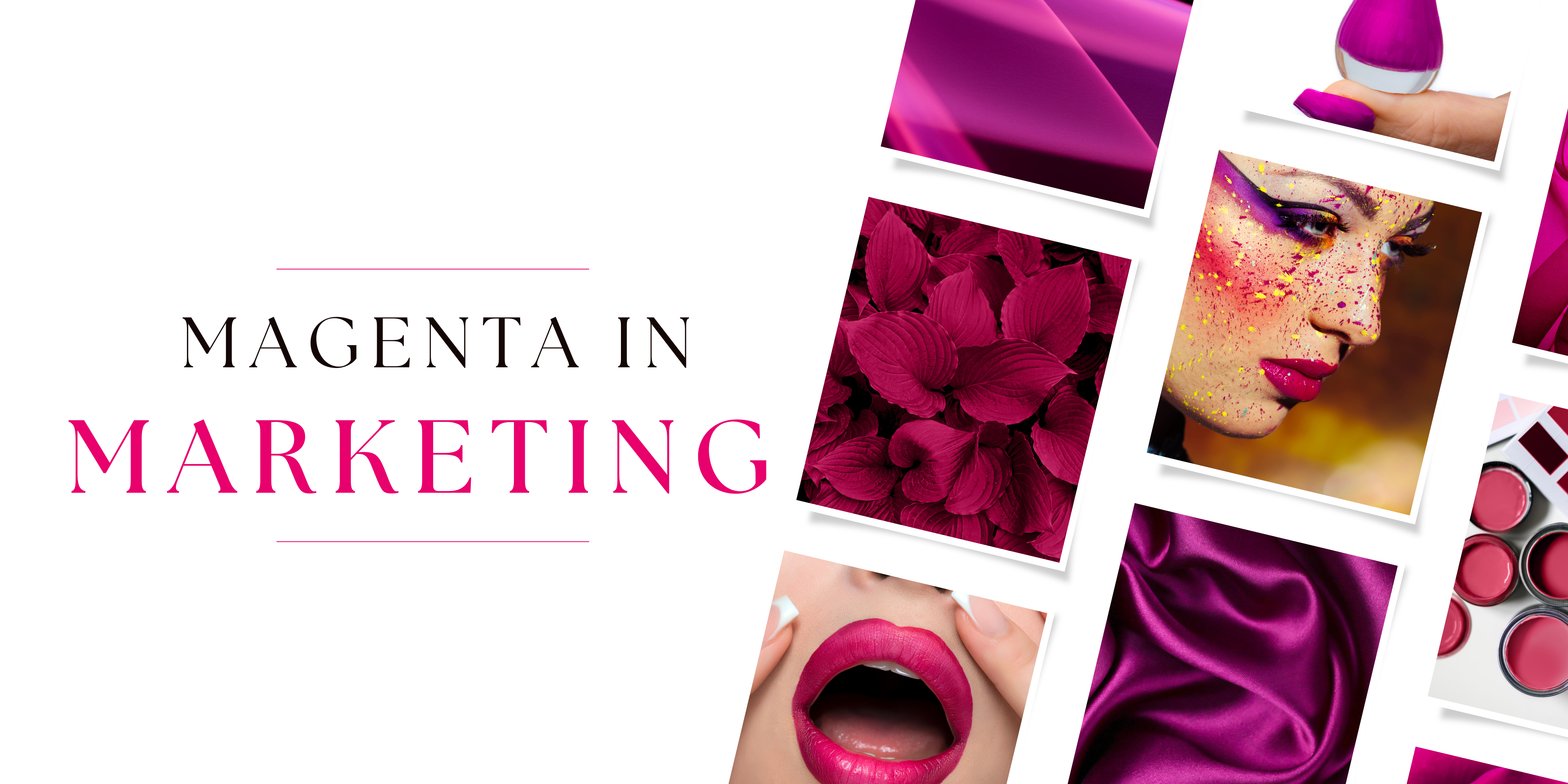
If you have any familiarity with horsemanship, there are many different breeds you can choose from. There's the reliable quarter horse with a mellow personality and an easy gate. This is similar to most communication colors in marketing. There are, however, certain breeds - like the Arabian - that are full of hot blood and fire. They are almost impossible to control and can challenge you at every turn in their unpredictability. That kind of spunk is wholly reserved for the color magenta.
Magenta, a color that sits between purple and red on the color spectrum, holds a bold and vibrant presence. Often associated with creativity, innovation, and a touch of rebellion, magenta stands out as a dynamic choice for those looking to make a bold statement. Its blend of red's energy and purple's sophistication creates a color that exudes modernity and originality.
In psychology, magenta is linked to qualities like passion, imagination, and a forward-thinking mindset. Its bold and intense nature can evoke a sense of excitement, making it a suitable choice for brands aiming to project a contemporary and cutting-edge image. Magenta is often used to convey a sense of modern thinking and exclusivity without the traditional associations of red or purple.
I use magenta sparingly with brands and marketing plans. The personalities attached, like the CEO and CMO, need to be willing to polarize in their advertising. They will earn attention, both good and bad. People are going to self-identify quickly due to magenta's purple base, but they are also going to react with some kind of fiery nature due to its other base of red.
And, as the color is technically one our brain invents, there is never any sort of predictability with magenta, which can be amazing and terrifying at the same time.
Associations:
- Revolution
- Boldness
- Innovation
- Energetic Action
- Rebellious
- Assertive
Psychological Impact:
Magenta is a powerhouse of color. It is one of the only colors that doesn’t vary much in meaning.
From a psychological perspective, magenta is intertwined with qualities like passion, imagination, and a forward-thinking mindset. Its intense and bold nature can stir excitement, making it a suitable option for brands seeking to project a contemporary and cutting-edge image.
Magenta diverges from the norm, offering a unique avenue for expressing modern thinking and exclusivity, distinct from the conventional associations of red or purple. It is also a color that allows you to showcase a new way of thinking or a new idea, a new lifestyle, making it great for brands who want to make their mark in a different way than we have seen.
Cultural Impact:
In Western cultures, magenta is synonymous with creativity and innovation, standing out as a color that evokes excitement and modernity. Notably, magenta holds significance in various global entities, from being featured in the flags of Cantabria (Spain), Magenta (France), and Cartago (Colombia) to representing the feminist movement in the United States and the United Nations He for She Campaign.
In Eastern cultures, while magenta may lack specific traditional associations, its lively nature finds expression in various domains, from the Reserve Bank of India's magenta-colored banknote to the Marine Corps' berets in Indonesia. Additionally, the Gulabi Gang in Northern India, a women's movement established in 2016, dons magenta attire as a symbol of empowerment and resistance against female oppression.
This rich tapestry of associations makes magenta a color that transcends boundaries and carries diverse meanings across different cultural landscapes.
Marketing Applications:
- Quick Service Food
- Fashion Accessories
- A Protest
- News
- For A Cause
When using the color pink in magenta - you have to make a bold decision.
- Most magenta's are very bright, like T-Mobile.
- Very few are more deep and soft-muted, but Pantone®'s magenta is a good example of this.
- Figure out if you want a more purple based or red based hue.
Marketers have successfully employed magenta in various industries, particularly those centered around technology, fashion, and creative pursuits. Technology companies often incorporate magenta into their branding to symbolize innovation and the futuristic nature of their products. In the realm of fashion, magenta is utilized to make a strong visual impact, creating a sense of trendiness and individuality.
When To Use The Neutrals: Black, White, Gray & Brown

In the realm of color psychology, the neutral tones of black, white, gray, and brown emerge as indispensable players, seamlessly complementing the vibrant communication colors.
Together, these neutral colors create a harmonious symphony, offering designers and marketers a rich palette to evoke emotions, convey messages, and build cohesive brand identities.
The truth is, these colors are not going to make someone feel something very strongly. They don't cause a measurable reaction in the body, emotions or mind. And that's a good thing.
We can utilize these colors to help support our primary communication colors - I like to call them "whitespace" colors.
If our entire site, social feed or advertisement was just one strong yellow, it would be overwhelming for a viewer!
That's where we can bring in these whitespace colors to bring balance and harmony to a marketing aesthetic.
Black: In the spectrum of color psychology, black is a powerful anchor. Synonymous with sophistication, it adds a touch of elegance to brand aesthetics. When strategically employed, black enhances the perceived value of products and creates a sense of luxury. In marketing, black serves as a versatile backdrop, allowing vibrant communication colors to pop and catch the viewer's attention. Its classic and timeless appeal makes it a staple in branding and design.
White: The color white, a symbol of purity and cleanliness, plays a pivotal role in minimalist aesthetics. In design and marketing, white acts as a canvas, providing a clean and fresh background that allows other colors to shine. It conveys a sense of simplicity and modernity, contributing to a sleek visual language. White is often employed to evoke feelings of clarity, openness, and purity, making it a popular choice in industries where these qualities are paramount.
Gray: Gray, a neutral hue with endless versatility, seamlessly adapts to support and enhance the vibrancy of other colors. Its understated elegance and neutrality make it an ideal background color in various design contexts. In marketing, gray can convey a sense of balance, sophistication, and timelessness. Whether used as a backdrop or as a primary color, gray's adaptability contributes to creating cohesive and visually appealing brand identities.
Brown: As an earthy and warm tone, brown introduces a sense of reliability and natural authenticity to marketing endeavors. Often associated with the earth and nature, brown can evoke feelings of warmth, comfort, and groundedness. In product packaging and branding, brown is employed to create a sense of familiarity and trust, especially in industries connected to organic, artisanal, or natural products.
Combining Neutral Colors: Together, these neutral colors form a harmonious symphony within the color palette. Black and white, with their contrasting dynamics, create visual interest and clarity. Gray acts as a bridge, adapting to different contexts, while brown introduces a touch of warmth and authenticity. The combination of these neutral tones offers designers and marketers a rich and balanced palette to evoke emotions, convey messages, and build cohesive brand identities. Whether used independently or in concert with vibrant communication colors, neutrals play a fundamental role in shaping visual experiences and consumer perceptions.
One powerful aspect to consider is the interplay of these neutral colors with typography. Fonts and text elements presented in black on a white background often signify clarity, professionalism, and a timeless aesthetic. Gray, with its adaptive nature, allows for subtle contrasts and highlights, facilitating readability in various design applications. Brown, when integrated judiciously, can infuse warmth into textual elements, resonating with authenticity and approachability.
The strategic use of neutral colors in conjunction with bold communication colors enables a hierarchy in design, guiding the viewer's attention and emphasizing key brand elements. This thoughtful balance contributes to the overall visual identity, ensuring that the brand's messaging is not only aesthetically pleasing but also effectively communicated.
In essence, the power of neutrals lies not only in their individual characteristics but in their ability to create a cohesive and impactful visual language when thoughtfully combined with other elements of design. Use these colors to support your powerful, communicative colors and watch the conversions align!
Utilizing Color Psychology In Your Marketing Plans

Color stands as a formidable force in the marketing realm, wielding influence on brand recognition, consumer emotions, and overall behavior across a spectrum of platforms. Now, you're probably on my page of wanted to start implementing color psychology into your marketing strategies...but how do you actually do that?
Here are some ideas to spark your creativity, also known as "this is what you could do to take action on this intel":
1. Website and Landing Pages:
-
Consistency is King: Think Facebook - that cool blue vibe is everywhere, from the logo to the buttons. It's like your digital home, always welcoming.
-
Button Power: Imagine a "Buy Now" button in fiery red on a calm blue background. Pow! That's contrast may make it irresistible.
-
Blue for Trust: Have a "Trust Us" section? Blue is your color. It's like a digital handshake saying, "We're reliable."
2. Social Media:
-
Platform Harmony: Instagram is vibrant and multicolored and Facebook leans blue. Match your palette to the platform to blend in while standing out.
-
Visual Storytelling: Airbnb nails it. Muted tones for cozy cabins, vibrant pops for city adventures. It's a visual journey.
-
Logo Brilliance: Starbuck's logo always pops, no matter the background. Your logo should too.
3. Printed Materials:
-
Contrast Magic: Black text on a white background or vice versa. The classic combo that screams readability. Inject bits of color where you can to make the person reading it feel something.
-
Brand Blast: Ever noticed Apple's product guides? That sleek white booklet with minimal text in Apple's signature gray. Then the phone in a pop of color to get attention. Brand consistency at its finest.
-
Feeling with Color: Check out travel brochures. Calm blues for beach getaways, fiery reds for adventurous hikes. Colors set the mood.
4. Email Marketing:
-
CTA Charm: Take a look at Dropbox emails. Blue buttons that say, "Get Started." Click-worthy, right?
-
Segmentation Fun: Amazon does this well. Different colors for deals, recommendations, and order updates. It's like a colorful inbox party.
-
Branded Templates: Can't miss Airbnb's emails. That familiar color scheme, from the logo to the background, says, "Hey, it's us!"
5. Video Content:
-
Grading Goals: Watch a National Geographic video. Warm tones for savannah sunsets, cool blues for ocean depths. It's like a color journey.
-
Logo Animation Magic: Pixar does it right. Their logo animation uses colors that represent their creativity and playfulness.
-
Consistency Wins: Check out TED Talks. Each video maintains color consistency, creating a visually harmonious experience.
6. Product Packaging:
-
Shelf Dominance: Walk into a supermarket. Bold Coca-Cola red steals your gaze. That's the power of standing out.
-
Brand Recognition: Tiffany & Co.'s iconic blue boxes. Instantly recognizable, making you feel like you're holding a piece of luxury and treasure.
-
Psychological Picks: Nature Valley's granola bars. Earthy greens and browns say, "Healthy and natural."
7. Digital Advertising:
-
Contrast Kings: Spotify's ads. Those bold greens and blacks make the platform's green logo pop.
-
Imagery Brilliance: Apple's iPhone ads. Sleek, colorful product images with a white background. It's like an art gallery for gadgets.
-
Simplicity in Palette: A simple and clean look with strong but few colors. Less is often more in the digital ad space.
8. In-Store Displays:
-
Store Atmosphere: Walk into an Apple Store. White walls, clean lines. It's like a tech sanctuary. Colors are carefully chosen for instinctual purchase power.
-
Color-Coded Magic: IKEA does this well. Each section has its color theme, guiding you through the store with ease.
-
Sale Signage Sparks: H&M's red sale signs. Bold and attention-grabbing, making you stop and shop.
9. Mobile Apps:
-
UI Harmony: Instagram's app. That consistent mix of whites, grays, and vibrant red notifications. It's a visual treat.
-
Brand Recognition Boost: Starbucks' app. That iconic green logo is a beacon for coffee lovers.
-
Alert Vibes: WhatsApp nails it. Green for messages, red for calls. It's like a traffic light for your notifications.
10. Podcasts and Audio Branding:
-
Visual Hooks: Joe Rogan's podcast cover art. Bold and vibrant, making you stop and hit play.
-
Consistent Colors: Spotify's podcast interface. Whether on the app or desktop, the green brand color is always there.
-
Visual Brand Appeal: Check out TED's podcast. The bold red TED logo is instantly recognizable even in audio spaces.
11. Live Events and Experiential Marketing:
-
Booth Brilliance: Comic-Con booths. Every booth, a burst of colors representing different fandoms.
-
Staff Style: Apple Store staff in their blue shirts. It's like having brand ambassadors walking around.
-
Signage Magic: Disney World's colorful signs. Bold and whimsical, guiding you through the magical experience.
12. Augmented Reality (AR) and Virtual Reality (VR):
-
Immersive Hues: VR gaming experiences. Colors that enhance the mood, from calming blues to fiery reds for intense action.
-
Virtual Branding: Oculus VR headsets. Sleek black with minimal branding in white. It's like having a virtual brand tag.

Conclusion
Embarking on a vibrant adventure through the world of color in marketing has been nothing short of illuminating. From the calming blues that establish trust to the fiery reds that ignite passion, each hue crafts a unique tale for your brand.
Imagine your website as a digital home, welcoming visitors with consistent colors that resonate like a familiar friend. Picture social media as a visual journey, where each post tells a story through a carefully chosen palette. And don't forget the power of packaging or your online shop, where bold colors make your products stand out on the shelves like stars in the night sky.
As we delve into the kaleidoscope of hues, it's clear that every color has a role to play. Whether it's the warmth of yellow grabbing attention or the sophistication of purple building deep relationships, each shade dances in harmony with the psychology of perception. Picture the energy of orange in Eastern cultures symbolizing spirituality and sensuality. Envision the royal elegance of purple, not just in mystical realms but as a catalyst for explosive growth in the business world.
Colors aren't just visuals; they're the architects of emotions, creating connections that transcend the digital realm.
So, as you navigate the color palette for your brand, remember this vivid spectrum isn't just about aesthetics; it's about creating an experience. From the calm blues of trust to the energetic reds that spur action, your color choices are the strokes that paint your marketing masterpiece. Feel free to experiment, but let your brand's personality shine through the colors you choose.
In this vibrant journey, you're not just creating a brand; you're crafting an emotional connection with your audience. Cheers to a colorful and successful marketing adventure!
COMMENT: Which color blew your mind in your marketing strategy?
Stay Color-Connected.
Join our private email community where you'll be the first to know about new articles, color tips + even more secrets about color psychology! 🌈
We don't spam. Mainly because Michelle doesn't eat pork.


Author


